Brands
New Vista Church
New Vista Church needed a logo and brand that reflected their multi-cultural congregation. The logo uses colors inspired by North, Central and South American native weavings and art work. The pallette represents the whole of the Americas. Each block of color is like a panel in a quilt or a stitch in a tapestry. And like a quilt or tapestry, its when all the colors are gathered together in unity, that the beauty and richness of the mark reveals its true meaning — we are all here because of the cross.

Tarrant Regional Water District
I designed a new brand for Tarrant Regional Water District (TRWD), including a logo, trail signs, vehicle graphics, a standards manual, and more. Our mission was to give TRWD a fresh look and show that they’re not just about water supply, but also about flood control, parks, bike and hiking trails, and entertainment along the Trinity River. The final mark not only looks like flowing water, but also looks like a river and its banks. So, it shows that TRWD manages all areas around the Trinity River.

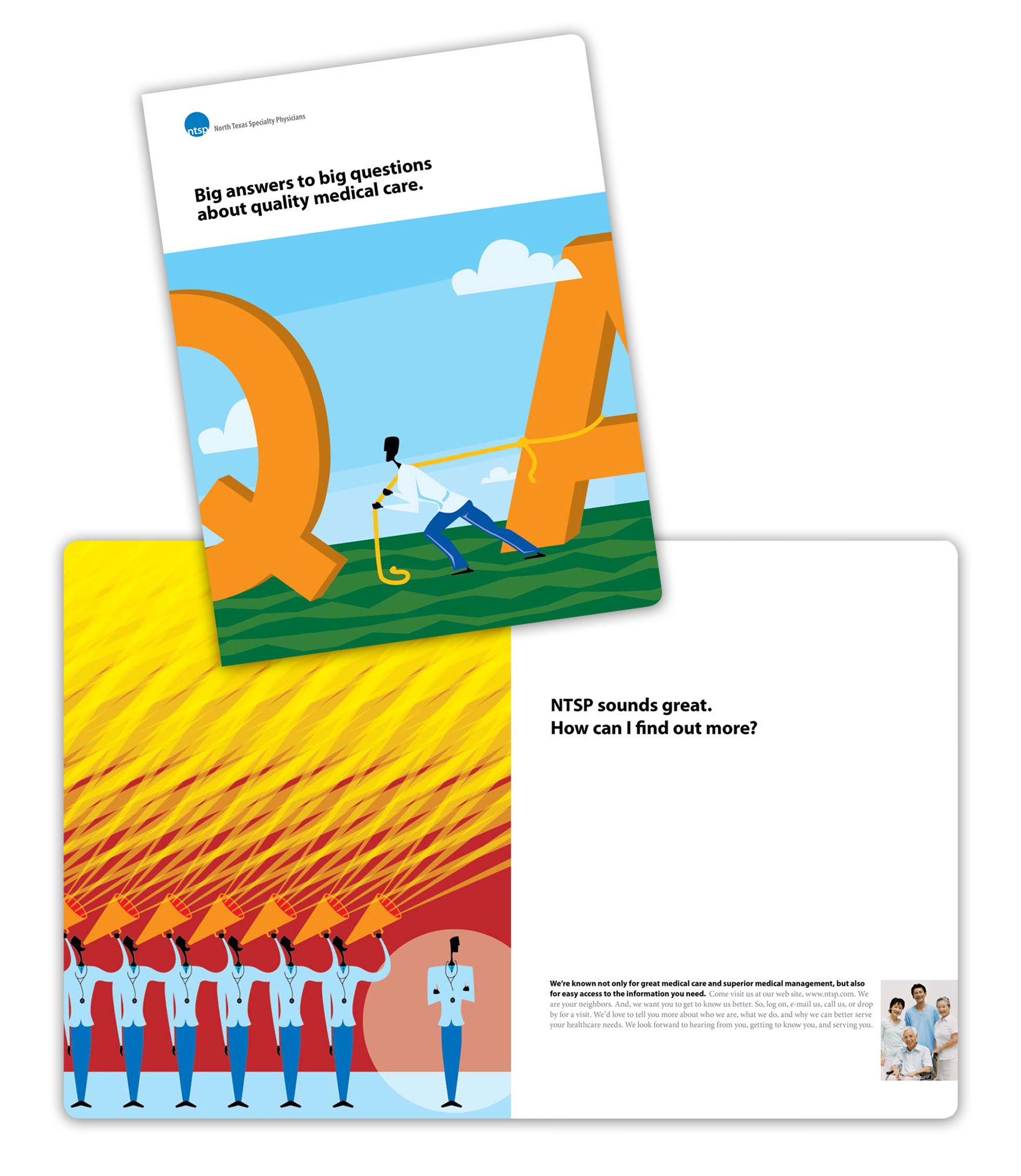
North Texas Specialty Physicians
North Texas Specialty Physicians wanted to give their brand a makeover and make it feel more welcoming to patients. I designed a new logo and marketing materials with illustrations that helped patients understand what makes NTSP different. The mark is simple and eye-catching and can be easily reproduced on various materials. The illustrations added warmth and friendliness to the organization, which was important to the client.


